“One size fits all is great—for hats, not websites. Responsive design in 2024? It’s not optional, it’s essential!”
Introduction
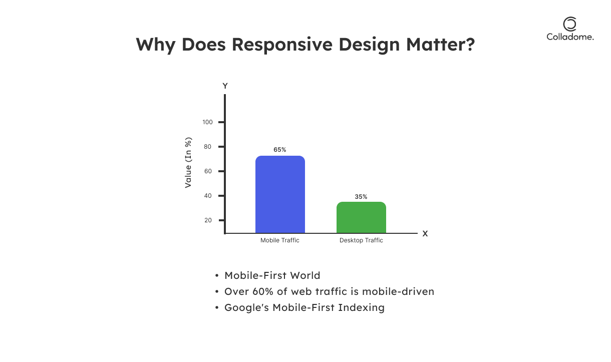
In 2024, responsive web design isn’t just a fancy buzzword—it’s the lifeblood of modern websites. With over 60% of web traffic coming from mobile devices, your website’s ability to adapt to any screen size is not just important; it’s non-negotiable. Mobile-friendly websites aren’t a luxury anymore; they’re a must-have. In fact, a responsive design can make or break your online presence.
Think about it: if your site’s clunky on a smartphone or tablet, users are bouncing faster than you can say “user experience.” And let’s not even start on the impact of responsive websites on bounce rates—they plummet when the site doesn’t work right. But a well-designed, responsive site? It’s a smooth, seamless experience for the user—no matter what device they’re on. That’s where the magic happens.
SEO and responsive design go hand in hand in 2024. Google’s mobile-first indexing means that the mobile version of your site is now the most important version for SEO ranking. If your site’s responsive, you’re already ahead of the game, helping both your SEO rankings and your UX. It’s not just about looking good on mobile; it’s about ensuring a flawless experience that Google and your visitors will love.
Whether you’re all about adaptive website design or making sure users stay glued to your pages, responsive web design is the secret weapon to boost your rankings, reduce bounce rates, and keep customers coming back for more. So, why is responsive design critical? It’s simple: it’s how you win at the digital game in 2024.
Why Responsive Design is Crucial in 2024
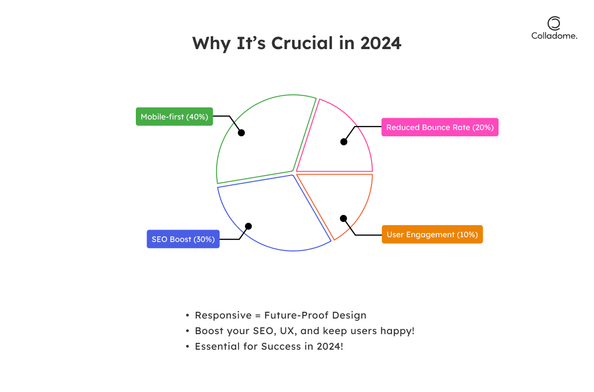
1. Mobile-First World
Mobile usage is dominating—over 60% of web traffic comes from mobile devices. Google’s mobile-first indexing, responsive design is a must if you want to rank well on search engines.
2. Boost Your SEO
Fast load times and low bounce rates are SEO essentials. A responsive site optimizes both, which directly impacts your ranking. Google rewards websites that offer a great mobile experience, so make sure your site’s mobile-friendly.
3. Superior UX
Responsive design ensures that your site delivers a seamless experience on any device. The easier you make it for users to navigate your site, the longer they stay—and the more likely they are to convert.
4. Future-Proofing
Tech evolves, and so should your website. Responsive design adapts to any screen size, meaning it’s ready for whatever new device or platform emerges. No need for constant redesigns.
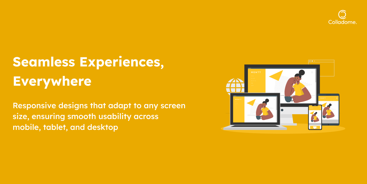
What is Responsive Design?
Responsive web design is all about ensuring that your website adapts seamlessly to any screen size—whether it’s a smartphone, tablet, or desktop. It’s the key to creating mobile-friendly websites that not only look great but perform well across all devices. Here’s how it works:
1. Fluid Grids
Gone are the days of rigid layouts. With fluid grids, your website’s layout resizes proportionally based on the screen size. Think of it like your content “flowing” to fit any space—whether it’s a phone or a giant desktop screen.
2. Flexible Images
Flexible images automatically adjust to fit within their containers. So, no more cramming oversized images into tiny screens or having them look weird on bigger monitors. They scale perfectly, making sure your content looks stunning, no matter the device.
3. Media Queries
These are like the superheroes of responsive design. Media queries are CSS techniques that apply different styles based on the device’s characteristics (like screen width, resolution, or orientation). Essentially, it allows your site to “detect” what device is being used and adjust accordingly.
Why Does It Matter?
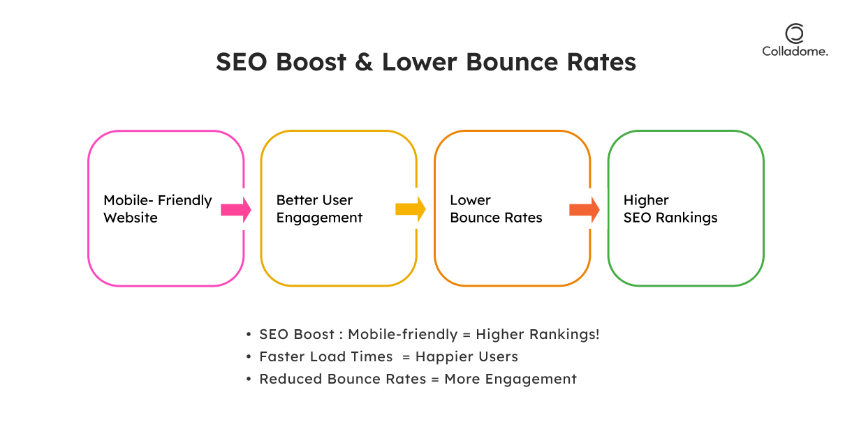
- SEO and Responsive Design: Google loves mobile-friendly sites. In 2024, responsive design isn’t optional; it’s critical for your SEO rankings. The better your site adapts to mobile, the better it performs on search engines, boosting visibility.
- Impact on Bounce Rates: A responsive website minimizes the likelihood of users bouncing off your site due to poor design or slow load times. This is crucial for reducing bounce rates and increasing engagement.
- User Experience (UX): Nothing turns visitors away faster than a site that’s hard to navigate on mobile. Responsive design ensures a smooth and pleasant experience, keeping your audience engaged longer and improving conversion rates.
How Responsive Design Works to Boost SEO and UX in 2024
Responsive web design is more than just a trend—it’s an absolute game-changer when it comes to SEO and user experience (UX). Let’s break it down:
1. SEO Benefits: Why Google Loves Responsive Design
In today’s digital landscape, SEO and responsive design are the perfect match. Here’s how:
-
Improved Rankings
Google’s mobile-first indexing means it looks at the mobile version of your site as the primary one for ranking. A responsive design ensures that both your desktop and mobile versions are one and the same, giving you a better shot at ranking higher.
-
Faster Load Times
Speed kills, but in a good way! Responsive websites typically have optimized images and leaner code, meaning faster load times. And guess what? Google loves speed—sites that load faster are more likely to be rewarded with higher rankings.
-
Reduced Bounce Rates
Ever landed on a site that was a pain to use on your phone? Yeah, we all have. And when users bounce, Google notices. Mobile-friendly websites with adaptive website design keep users engaged longer. When users stick around, it signals Google that your content is high-quality, lowering your bounce rate and pushing you higher in the rankings.
2. Enhanced UX: How Responsiveness Translates to Better User Experience
UX and responsive design go hand in hand—when one shines, so does the other:
-
Consistent Navigation and Readability
Whether it’s a 5-inch phone or a 27-inch desktop monitor, adaptive websites adjust for optimal viewing and usability. The result? Users enjoy a consistent and smooth navigation experience on any device. They don’t need to zoom in, pinch out, or scroll endlessly to read your content.
-
Better UX = Higher Conversions
A responsive website design doesn’t just look great—it works. When users have an enjoyable experience, they’re more likely to take action, like making a purchase or signing up for your newsletter. The smoother the UX, the higher your conversion rates—simple as that.
Real-World Examples of Responsive Design in Action (2024)

India: Leading the Way in Responsive Design
-
Zomato
Zomato’s responsive web design is a prime example of mobile-first thinking. As a food delivery giant, they’ve made sure that their website is mobile-friendly and SEO optimized, offering users a seamless experience across all devices. Whether you’re browsing on a 6-inch phone or a 13-inch tablet, Zomato’s adaptive design ensures quick load times and easy navigation. This, in turn, helps them retain more users and reduce bounce rates, making them a leader in the competitive food delivery space. Zomato’s quick and easy-to-navigate platform keeps hungry users coming back for more—one-click ordering at its finest.
-
BookMyShow
BookMyShow is an entertainment booking platform that knows the importance of keeping users engaged across various devices. From movie ticket bookings to event reservations, BookMyShow’s responsive layout adapts perfectly to different screen sizes. By focusing on adaptive website design, they ensure that users can easily browse and book tickets without any hassle. Their SEO and responsive design strategy also contribute to high visibility in search engines, increasing organic traffic and reducing bounce rates. It’s a win-win, where great UX and responsive design drive high user satisfaction and higher conversion rates.
Worldwide: Global Players with World-Class Responsive Design
-
Airbnb
When you think of a company that serves a global audience, Airbnb stands out. Their mobile-friendly websites offer a flawless experience, whether you’re booking a place for a weekend getaway or a month-long stay. Airbnb’s responsive web design means that users, no matter where they are in the world or which device they’re using, will have a smooth, intuitive experience. This adaptability boosts their SEO rankings and drives higher engagement, as users spend more time browsing listings, which reduces bounce rates. Airbnb has truly mastered the art of mobile-first indexing, ensuring they remain visible and competitive.
-
Nike
Nike has made responsive web design a core part of their e-commerce success. Whether you’re buying running shoes or browsing the latest sportswear, Nike’s adaptive website design adapts seamlessly to desktops, tablets, and smartphones. This mobile-friendly design not only enhances the shopping experience but also contributes to higher conversion rates—especially on mobile, where customers are ready to buy on the go. By optimizing their site for all devices, Nike has successfully driven up sales and SEO rankings, while maintaining a user-friendly UX across platforms.
Statistics Highlighting Responsive Design’s Impact
- Mobile Traffic: As of 2024, mobile devices are expected to account for over 55% of all global web traffic. The share of mobile traffic varies by region, with Africa and Asia leading at 73.6% and 69%, respectively. (source)
- Bounce Rates: Websites that utilize responsive design have been shown to have 20% lower bounce rates compared to those without it. This suggests that users are more likely to stay on responsive sites because they offer a seamless experience across all devices. (source)
- Google’s Mobile-First Indexing: Since Google shifted to mobile-first indexing, websites optimized for mobile have an advantage in search rankings. Mobile-first indexing impacts more than 90% of Google’s search results, making responsive design crucial for SEO. (source)
Responsive vs. Adaptive Design: A Quick Comparison
| Feature | Responsive Design | Adaptive Design |
| Flexibility | Like a chameleon on a sunny day! Fluid layout adjusts to fit any screen. Whether it’s mobile, tablet, or desktop, it just gets it right. | Think of it as a tailored suit. Predefined layouts for specific devices—so it’s custom, but with less wiggle room. |
| SEO Benefits | Off the charts! Google loves responsive design for its mobile-first approach. It ranks high, fast, and effortlessly. | SEO’s good, but not as golden. While mobile-friendly, it’s not as adaptable across all devices, so it might fall short on Google’s radar. |
| Implementation Time | Quick and snappy! Build once, and you’re done. Less coding, more action. | More time-consuming—think of it like building a custom car. You’ll have to craft for different devices, so buckle up! |
| Cost | Super affordable. It’s a one-size-fits-all approach without burning a hole in your pocket. | More expensive. It’s like buying a designer wardrobe. Predefined layouts require extra resources for each device—so it can add up fast. |
How to Implement Responsive Design for Your Website:
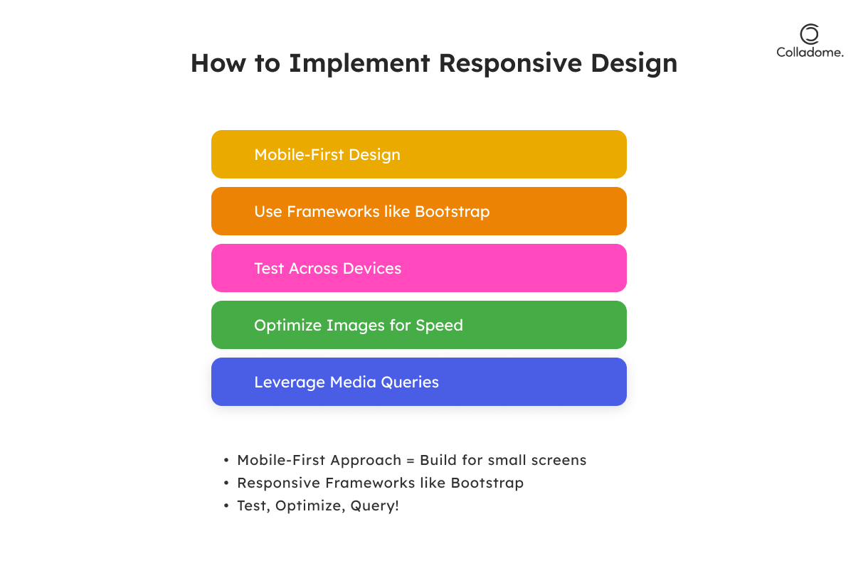
Responsive design doesn’t have to be complicated—it’s about creating a fast, mobile-friendly experience that works for all screen sizes. Here’s how to do it right:
1. Start with a Mobile-First Approach
Design for smaller screens first, then scale up. Google loves this strategy due to mobile-first indexing, which boosts your site’s SEO.
2. Use Responsive Frameworks
Frameworks like Bootstrap or Foundation streamline the process by providing built-in responsive design features, speeding up development while ensuring your site looks great on any device.
3. Test Across Devices
Use tools like BrowserStack to test how your website performs on different devices. This ensures a consistent UX across all screen sizes, keeping users engaged and improving SEO.
4. Optimize Images
Use responsive images and lazy loading to enhance speed. Faster load times lead to lower bounce rates, which Google rewards in rankings.
5. Leverage Media Queries
CSS media queries adjust styles based on device characteristics, ensuring your website is perfectly tailored to every user’s device.
Conclusion:
In 2024, responsive web design isn’t just a trend; it’s a necessity. If you’re looking to stay ahead in the digital game, there’s no way around it. From boosting SEO rankings to delivering a seamless user experience across every device, responsive websites are the secret sauce for online success. Gone are the days of desktop-first; now, it’s all about ensuring your site shines on mobile and beyond.
At Colladome, we get that making your website mobile-friendly is non-negotiable. With the rise of mobile-first indexing and Google’s preference for responsive design, we help you build websites that are not just adaptable but future-proof. We’re talking about smoother navigation, lightning-fast load times, and better engagement that will help your site climb the search rankings while keeping users hooked. Your digital presence deserves the best, and Colladome is here to take it to the next level.
Call to Action:
Is your website ready to thrive in the mobile-first world of 2024? Don’t wait until you’re left behind. Whether you’re just starting out or revamping your existing site, now’s the time to switch to responsive design. Reach out to Colladome today to consult our team of experts, or dive into responsive frameworks like Bootstrap to get the ball rolling. Let’s make your website not just mobile-friendly but mobile-fantastic!